This is a post about failure and success - no, not my daughter! But her birthday card that turned into multiple efforts, was definitely a lesson in perseverance....
You may think it strange that I chose to do a sunflower for a spring birthday, but that is her favorite flower . And honestly, I wouldn't mind channeling a little fall weather right now with all of the heat and fires we have had here in San Diego county the past week. It has truly been the worst I have ever seen, and I have lived here most of my life. I have never seen the Santa Ana winds that bring the hot, dry air in the month of May - never. And ten fires in two days all in our county? It has been absolutely unbelievable. I am so very grateful that no one I know lost their home or was injured. And I am counting my blessings. There are dry areas of brush and growth everywhere and , as my parents always said, "there but for the grace of God go I." So today, I am full of gratitude.
Back to the sunflower.... this is one of Dominic's beautiful flowers and it cut perfectly. In hindsight, I should have used a card stock weight material for the this flower. I really do love how it turned out, but with the way the text weight paper buckled under the glossy accents....well I ultimately could not send it to her. And yes, tried putting it under a heavy book (several) overnight that that just didn't work. Note to self: Know when to stop when embellishing a card! So as much as I love the look of the card with the glittered glossy accents, it will not be on it's way to her (at least not this year!!!)
It's the buckling of the outer frame that really bothered me. I love the look of it but was just so unhappy with the final presentation. So maybe not a total failure, but still not a card
I felt I could happily send to my daughter!
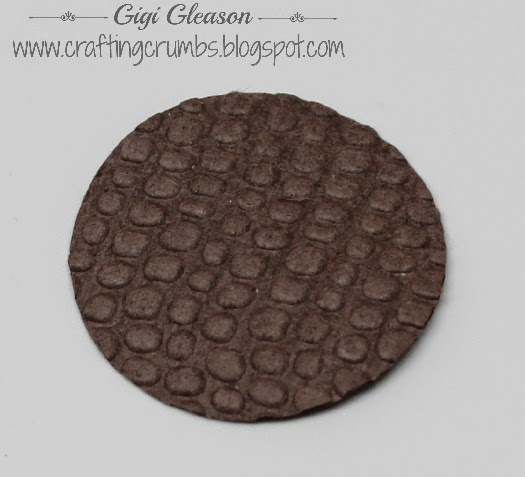
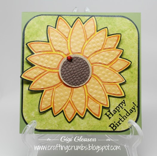
So...... late last night I decided I just needed to try again and do something different . Feeling like I needed to stick with the sunflower theme, I found a free clip art of a sunflower stencil that seemed quite simple. Of course, true to form , I could not leave well enough alone! LOL So I traced the design in SCAL and added several shadow layers for a little more interest. The shimmery papers that I love are from Paper Temptress - the mica line - and the center of the sunflower is ruche paper - love the texture and it cuts easily with the Silver Bullet Pro.
Initial cutting of the top layer of petals (bad lighting - didn't adjust for night light)
Individually embossed the petals (5 at a time so I wouldn't lose the placement) and glued to the orange(truer color below) before I removed them from the mat.
An unexpected bonus - a negative stencil created from the orange petals.
Expect to see this as part of another card at some point!
Layered petals with two shadow layers - a yellow/gold marbled cardstock and
antracite mica (Paper Temptress) to give it that "pop".
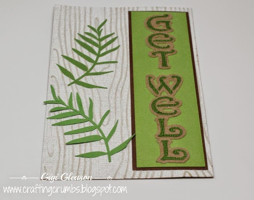
I embossed each of the amber sunflower petals with a dot embossing folder before attaching them to the flame petals. And the dark brown ruche center was embossed with a "mesh" folder for even more texture.
Chocolate brown ruche cardstock (Paper Temptress) embossed with a the Mesh embossing folder.
The sunflower center with a visitor. Do you love that little ladybug as much as I do??
Did you see the cute little ladybug sitting in the center of the flower?? I made that thanks to the inspiration of Susan Tierney-Cockburn (Susan's Garden)!
This blog has a great explanation of how to make them with the Viva Decor Pens. I want to make more - they are so much fun and so easy. And I think it would be fun to use a similar technique to make other things ... just what I need - more ideas of things to create! :)
A view of the finished card with all of the elements together. So happy with this one!
I kept the same sized card as the first one since the greeting on vellum was already printed and the envelope was addressed and stamped! I really do like the square cards - there is just something nice and clean about the presentation - not too small and not too large! Juuuuuust right! (channeling Goldilocks here!)
Another view. It's all about the ladybug - she makes me smile!
This is one of those times when starting over was clearly the right thing to do.
I hope you enjoy these cards - and learn from my mistakes. I would like to say that I will not make this same error again, but...... I don't necessarily learn the first or even second time around. I am still going to think about how to save part of this so if I come up with a good alternative (already thinking of one) I will post it later... so stay tuned for more experiments from the craft room.
And I have a ton of online class videos to watch, so hope to be having some fun with new techniques. I want to improve my marker coloring, play with colored pencil shading that I used to love to do, learn how to stamp with watercolors and more.
Also looking forward to having a little more time in the kitchen to share some fun summer recipes.
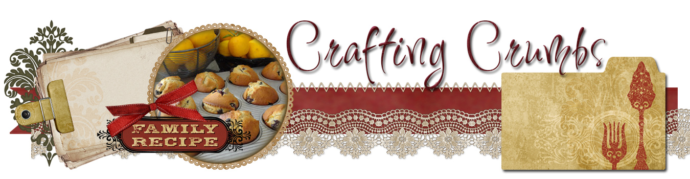
Stay tuned and stay well.....
HAPPY BIRTHDAY, Missy!
Pin It Now!